Every now and then I find myself in a situation where the focal length of my lens is not wide enough to capture my desired field of view. While I could certainly whip out my iPhone and use the camera's Landscape feature (which does a pretty nice job in my opinion), there are times when I prefer to create a higher resolution final image, to have the flexibility to adjust shadows/highlight, or to generate a HDR landscape. In those situations, I take multiple overlapping photos and stitch them together using a desktop application on my iMac.
While there are many well-written articles about to compose your images or adjust your camera settings prior to stitching, in this post I will focus on the post-processing aspect and review 2 applications that have been around for many years: PTGui and DoubleTake.
PTGui. Despite the rather unattractive name of this app (it stands for Panorama Tools Graphical User Interface), I feel like it is excels in many categories. In particular, it does a very good job of automatically detecting overlapping borders, even in situations where I shoot multiple rows of images. Additionally, it tends to generate a sufficient number of control points (these are pixels of the overlapping photos that are used as a reference to calculate how photos need to be warped upon stitching) and enables the user to modify or add additional control points to optimize the output. Finally, when previewing the resultant stitched image, there are multiple presets as well as options to modify the perspective so that you can fine tune the look and feel.
DoubleTake. While PTGui has more features and possibly has a slightly steeper learning curve, DoubleTake seems to have been created with simplicity in mind. However, its simplicity is achieved at the expense of capabilities and quality. For example, while DoubleTake tends to perform well when stitching a single row of overlapping photos, it fails to stitch multiple rows of photos, and I could not figure out how to do it manually either. If you can get the images to stitch, you can use some alignment features, but most of it feels pretty "automatic" as you can align entire images, but there do not appear to be options to fine-tune the stitching.
There are other photo stitching applications, but these are the only 2 that I have experience with. I've used PTGui for nearly a decade now, and it has performed exceptionally well for just about every batch of photos I've thrown its way. While I had evaluated DoubleTake when I first started using PTGui, I thought I'd give it another try to see if it would supplant my current photo stitching workflow, as I assumed the app's feature set would have continued evolving and improving. However, DoubleTake didn't even come close. PTGui has served me well, and I'm sticking to it for now.
Sunday, May 31, 2015

Wednesday, April 8, 2015
My Walking + Running Data on iOS 8
Since upgrading to iOS 8, I have been tracking my running data using Apple's Health app. With my old iPhone 5 running iOS8, I had been manually entering my run distances--I know that I could pair the Health app with a variety of running apps to have the data tracked automatically, but I stopped using them because they exert a heavy toll on battery life (see my post on running apps for more). After upgrading to my iPhone 6 Plus, I have enabled Fitness Tracking (Settings > Privacy > Motion & Fitness) and feel that my running distances are tracked fairly accurately with the motion sensors that consume far less energy than GPS. Here's what my Walking + Running dashboard looks like:

Note the spike in activity during the March 28 to April 3 timeframe--that's when I went on a cruise (see this blog post for more) and ran on the ship's treadmill 1-2 times/day. Speaking of treadmills, despite turning on the iPhone Fitness Tracking option, I still have to manually input my treadmill run distances because I don't carry my phone in my hands when I run on treadmills, so my phone is not able to estimate run distances. Even if I did hold my phone while running on the treadmill, I wonder how accurate the data would be--perhaps I'll experiment with that scenario and blog about it later.
One thing I wish the Health app would do is to somehow differentiate between walking and running distances rather than merging them into a single "Walking + Running" distance. I can understand why Apple did this for technical simplicity, but I personally don't consider my daily walking distances to count as exercise--rather, that is simply a byproduct of being alive (for me personally--I know that many people walk for exercise as well which is great). Running, on the other hand, is what I prefer to track separately because I do it with the intent of improving fitness.
In any case, I am not really sure what I will do with this data in the future, but I expect that someone will write a cool app using HealthKit that will leverage personal health data to present insightful analytics and/or personalized recommendations to improve health and well-being. Oh developer, where art thou?
Note the spike in activity during the March 28 to April 3 timeframe--that's when I went on a cruise (see this blog post for more) and ran on the ship's treadmill 1-2 times/day. Speaking of treadmills, despite turning on the iPhone Fitness Tracking option, I still have to manually input my treadmill run distances because I don't carry my phone in my hands when I run on treadmills, so my phone is not able to estimate run distances. Even if I did hold my phone while running on the treadmill, I wonder how accurate the data would be--perhaps I'll experiment with that scenario and blog about it later.
One thing I wish the Health app would do is to somehow differentiate between walking and running distances rather than merging them into a single "Walking + Running" distance. I can understand why Apple did this for technical simplicity, but I personally don't consider my daily walking distances to count as exercise--rather, that is simply a byproduct of being alive (for me personally--I know that many people walk for exercise as well which is great). Running, on the other hand, is what I prefer to track separately because I do it with the intent of improving fitness.
In any case, I am not really sure what I will do with this data in the future, but I expect that someone will write a cool app using HealthKit that will leverage personal health data to present insightful analytics and/or personalized recommendations to improve health and well-being. Oh developer, where art thou?
Monday, April 6, 2015
Carnival Cruise Revelations and Factoids
Given that the theme of this blog is about my digital lifestyle, today's post could be considered antithetical to the purpose of the blog. Nevertheless, I'd like to share some revelations and factoids from a 1-week Mexican Riviera cruise that I took last week.
- Caffeine Cleansing. While on board, the food, water, and juice was part of the all-inclusive fee, but there were extra charges for sodas so I remained soda-abstinent for a full week. While the offered free coffee, I typically don't drink much coffee so I avoided that too. I thought that after going a full week without any caffeine, I might begin to feel some symptoms of withdrawal or perhaps even a sense of elation, but I simply felt no different.
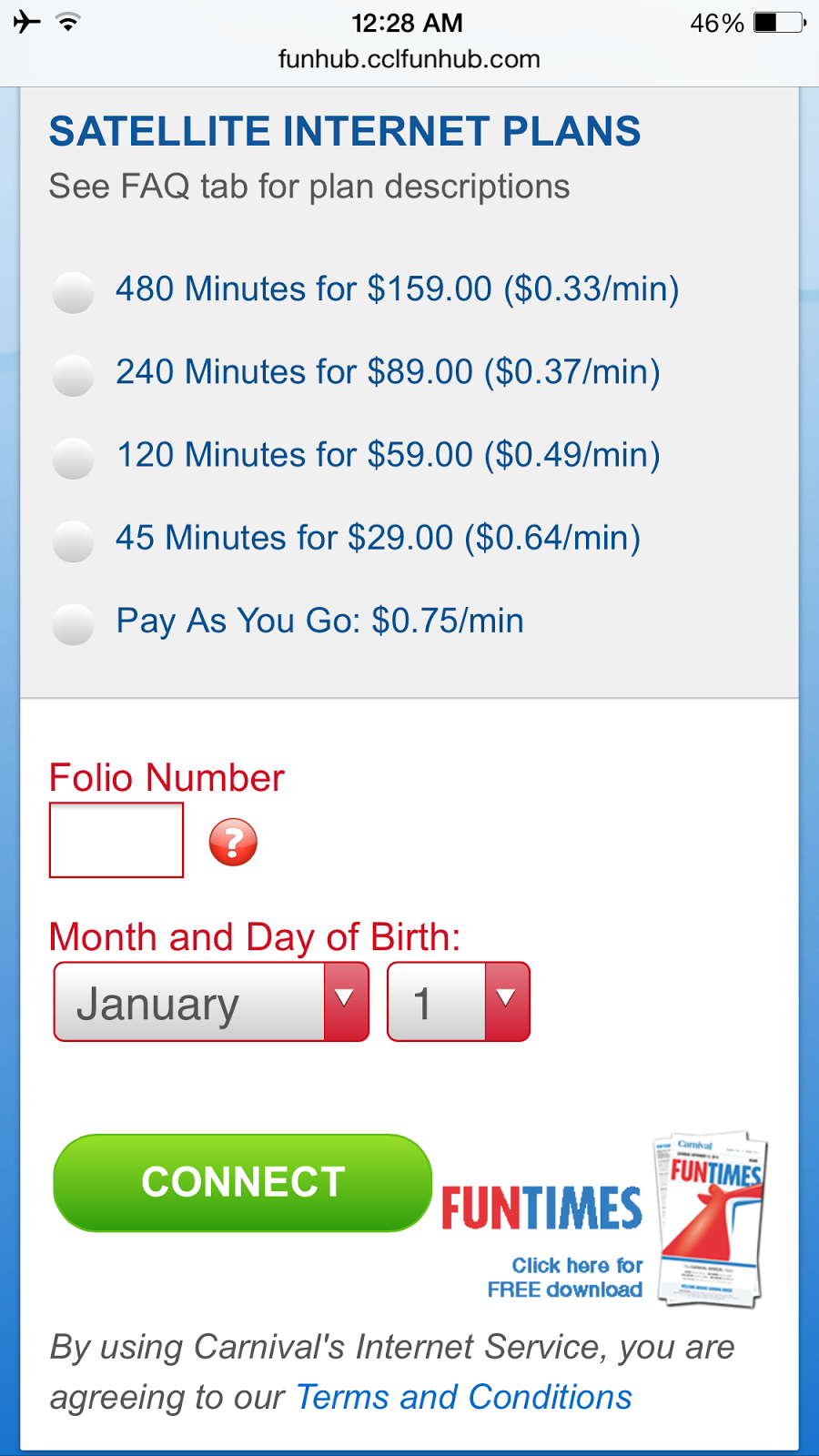
- Internet Cleansing. I rarely unplug completely from work and social media, but when I saw the rates that Carnival was charging for satellite internet, I decided to forego connections to the rest of the world. Going a full week without internet access was not as hard as I thought it would be, especially with the fee schedule below.
- Cellular Cleansing. There are no cellular towers out at sea, so communication can be difficult without cell phones, especially with large parties (we had 14 in our group). Walkie talkies would have come in handy aboard the cruise ship.
- Body Cleansing. Given that I shared a room with 3 other people, there was competition for bathroom time which forced me to look for alternatives. To my surprise, I discovered that the showers in the gym were better than the ones in our personal cabin. The gym showers were equipped with rain shower heads and 4 additional shower heads on the side (not that I needed them), and there was much more space to dress.
- Wallet Cleansing. I was not too surprised to encounter sneaky hidden fees—for example, the waiters asked if we would like sparkling water or bottled water, but they did not mention the option to drink regular ice water which was free. After being charged $5 for 1 liter of bottled water during my first meal, I learned to ask for regular ice water.
Do you have any questions for me about my Carnival cruise experience? Let me know by posting a comment and I'll do my best to reply.
Saturday, March 7, 2015
Editing with Apple Photos 1.0
I decided to sign up for Apple's OS X Beta Program to download the Mac OS X Yosemite 10.10.3 beta so I could get my hands on the new Photos app. Photos has received significant attention in the Apple community because it is the much-anticipated successor to both iPhoto and Aperture, Apple's consumer and professional photography workflow applications respectively. Here are my first impressions.
After updating from Mac OS X 10.10.2 to 10.10.3, the Photos app was already installed and sitting in my Applications folder. I also have both iPhoto and Aperture installed, and those were untouched by the installation, although the iPhoto icon in my dock was replaced by Photos. A Feedback Assistant application was also installed and placed in my dock, and the name is self-explanatory.
Upon first launch of Photos (version 1.0, build 205.44.0), I was provided the options to start with a blank Photos library or to import a library from iPhoto or Aperture. I imported my iPhoto library, and even though I only had approximately 2,200 photos (which is probably less than 1% of all the content in my entire library), the import process took about 15 minutes, and I did not have any other programs running in the background. Once you begin using Photos to store new photos and edit them, you are essentially committing to a new source of truth, as your photo libraries between iPhoto/Aperture and Photos will begin to diverge. In fact, upon launching iPhoto after my initial Photos import, it warned me that any changes that I made would not be reflected in my Photos library which I thought would be helpful for users who might not have understood that.
I was primarily interested in the photo editing options, so I will review them here. The navigation options are very simple and clean, true to my perception of Apple's philosophy about user interfaces. Upon selecting a photo, an "Edit" button appears, and upon clicking it you are presented with the following options:
In conclusion, Photos feels very much like a replacement for iPhoto. Its options are elegant and simple which will probably cater to the needs of most novice photographers. However, I doubt that many Aperture users will migrate to Photos--instead, they will move their photo assets to Lightroom or other similar applications. For me personally, I have historically only used iPhoto to store photos that I want to sync with my iPhone and iPad (whereas I've used Photoshop and Lightroom for RAW conversions and photo editing) and will probably do the same with Photos upon its official release.
After updating from Mac OS X 10.10.2 to 10.10.3, the Photos app was already installed and sitting in my Applications folder. I also have both iPhoto and Aperture installed, and those were untouched by the installation, although the iPhoto icon in my dock was replaced by Photos. A Feedback Assistant application was also installed and placed in my dock, and the name is self-explanatory.
Upon first launch of Photos (version 1.0, build 205.44.0), I was provided the options to start with a blank Photos library or to import a library from iPhoto or Aperture. I imported my iPhoto library, and even though I only had approximately 2,200 photos (which is probably less than 1% of all the content in my entire library), the import process took about 15 minutes, and I did not have any other programs running in the background. Once you begin using Photos to store new photos and edit them, you are essentially committing to a new source of truth, as your photo libraries between iPhoto/Aperture and Photos will begin to diverge. In fact, upon launching iPhoto after my initial Photos import, it warned me that any changes that I made would not be reflected in my Photos library which I thought would be helpful for users who might not have understood that.
I was primarily interested in the photo editing options, so I will review them here. The navigation options are very simple and clean, true to my perception of Apple's philosophy about user interfaces. Upon selecting a photo, an "Edit" button appears, and upon clicking it you are presented with the following options:
- Enhance. This appears to attempt enhance your photo, and there are no options--you either do it or you don't. I suspect that depending on your photo, you may or may not get good results, but I suppose it would be worth it for people to try it out.
- Rotate. By default, clicking this option will rotate your image counterclockwise, but you can right-click to reveal options to rotate clockwise.
- Crop. Clicking this option reveals an intuitive interface that allows for both cropping and rotation. An Aspect option allows you to select freeform or any number of common predefined aspect ratios which is nice. You can also flip your photo along its vertical axis. Curiously, there is an Auto option which seems to do all of this for you, but I haven't played around with it enough to judge whether it is useful or not. I would not plan to use it very often.
- Filters. This option simply presents a variety of 8 preset filters such as Mono, Noir, Fade, and Instant to produce a variety of effects. Personally I am not a big fan of filters so do not plan to use them.
- Adjust. Clicking this option reveals 3 groups of adjustment sliders. Each group displays an AUTO option when you mouse over the group, but there are also finer controls which I describe below.
- Light. Under this group, there are sliders for Exposure, Highlights, Shadows, Brightness, Contrast, and Black Point. While each one can be adjusted individually by sliding or typing in a value, adjusting the Light group slider results in simultaneous changes to all 6 parameters in that group. My initial impression is that this may seem very useful for quick edits, and I'd have to play around with this a bit more to see if the Light group slider produced the desired effect or if I would still find myself needing to adjust the individual sliders in that group.
- Color. Under this group, we have sliders for Saturation, Contrast, and Cast. Similar to above, you can drag individual sliders or the Color group slider.
- Black & White. Under this group, we have sliders for Intensity, Neutrals, Tone, and Grain. While you can drag the Black & White group slider, it has no effect on the sliders within the group.
- Retouch. This option provides what seems to be a hybrid of spot removal and clone stamping features, for those of you who are familiar with Adobe Photoshop terminology. There is a Size slider that allows you to define the diameter of the area you wish to edit, and there are simply instructions to "Click & drag over spots to remove" and "Option-click to choose the source area". I prefer Photoshop's options to let me either remove spots or to clone stamp because they produce slightly different results, although I can understand why Apple would cater to the masses by simplifying these two similar functions into one.
In conclusion, Photos feels very much like a replacement for iPhoto. Its options are elegant and simple which will probably cater to the needs of most novice photographers. However, I doubt that many Aperture users will migrate to Photos--instead, they will move their photo assets to Lightroom or other similar applications. For me personally, I have historically only used iPhoto to store photos that I want to sync with my iPhone and iPad (whereas I've used Photoshop and Lightroom for RAW conversions and photo editing) and will probably do the same with Photos upon its official release.
Tuesday, February 10, 2015
Open Letter to Marissa Mayer
Dear Marissa,
I admire you as a leader, and I respect the fact that you are able to both operate at an executive level as well as roll up your proverbial sleeves and code. It is because I think you are receptive to feedback that I am writing to you to share some thoughts about a few of your Yahoo assets that I've used for many years.
First, Yahoo Mail. I love the fact that I have unlimited storage space on Yahoo Mail. Because I often send and receive photos through email, the unlimited storage is probably the main reason I maintain my Yahoo Mail account. The other reason is that you've done a pretty darn good job with the spam filter. But let me offer some constructive criticism as well. You're trying to do too much with Yahoo Mail. The conversation threading is nice, but sometimes it is hard for me to follow which part of the thread I am reading and which item in the thread an action (e.g., delete) applies to, and so I have disabled the threading option. You're also getting too cute with the web page preview function when you paste a link in an email. Don't do this by default, I almost never want it. Rather, let me mouse over the link and let me expand the link into a preview. Otherwise you're just getting in my way. Another suggestion I have is to speed up the sending and receiving of email messages. With other email clients like Gmail, incoming and outgoing messages are processed within seconds, whereas with Yahoo Mail, it almost always takes minutes. Oh, and today you prevented me from sending an email altogether because you thought *I* was sending spam. I was sending a link to myself to remind me to read it later. Here's the message I received from Yahoo Mail:

So I did add some text and tried to re-send, but I got the same message again. I added even more text and resent, but again I received the same message. Eventually I gave up and used my trusty Gmail account instead. Gmail lets me get stuff done--it does a great job at performing core email functions very well. I wish Yahoo Mail could do the same thing reliably, but today it falls noticeably short.
Next let's talk about Yahoo Sports. I used to use Yahoo Mail almost exclusively to follow my favorite college and professional teams. But now you've tried to "fancy up" the site and in the process have reduced its usability. For example, when looking at a team's complete score history, you list the scores and put the higher score in bold, but it's hard to tell if MY team won or lost, especially since my team flip flops from the right side to left side depending on whether it was a home or away game. You used to put "W" or "L" in a column so I could easily tell, but now you make me work to figure it out. Bring back the W/L column please! Also, you've peppered the pages with ridiculous ads. I know that you need revenue to sustain your business, but could you at least make the ads less intrusive? It used to be that your ads were clearly offset to the top or sides of a page, but now you have listings of your stories (each with a photo and caption) with ads embedded within the listings. It simply feels less professional, and I don't enjoy your Sports pages as much so I visit other sports sites more frequently now.
Oh, I almost forgot to address Yahoo Search. Ironically, the reason I almost forgot to provide feedback is because I almost never use it. I'm not sure what algorithms you use for your search engine, but for the exact same search criteria, I usually find Google's search engine to deliver more relevant results, especially if I'm looking for something highly specific or esoteric. I get the sense that you are trying to differentiate Yahoo from Google by making Yahoo more of a content company at heart than Google which is more of a search company. However, I think you actually draw a lot of attention away from search. Even though www.yahoo.com has a search bar at the top, one's attention is directed toward the photos and stories farther down the page. And although you have search.yahoo.com dedicated to search, I never go there, and I would suspect that few others do either.
Finally, I'd like to conclude with comments about Yahoo Weather. Frankly I think you nailed it. Both the web site and your mobile app do things very nicely--that is, to provide the current weather and the forecast. I like your use of local images for the background as well as the Monthly Trends and Sun & Moon information boxes. And you've partnered nicely with weather.com for the extended forecast.
I know that I'm just 1 user, but my recommendation would be to provide a better user experience with Mail and Sports. Let's not get too cute with features and functions. Make sure you've covered the basics and implemented them well. Then if you want to add frills, make them options that people can toggle on/off as they please, but don't thrust upon your users things that they may never want to see or use. Best wishes with the turnaround of Yahoo.
Sincerely,
Digital Daddy in L.A.
I admire you as a leader, and I respect the fact that you are able to both operate at an executive level as well as roll up your proverbial sleeves and code. It is because I think you are receptive to feedback that I am writing to you to share some thoughts about a few of your Yahoo assets that I've used for many years.
First, Yahoo Mail. I love the fact that I have unlimited storage space on Yahoo Mail. Because I often send and receive photos through email, the unlimited storage is probably the main reason I maintain my Yahoo Mail account. The other reason is that you've done a pretty darn good job with the spam filter. But let me offer some constructive criticism as well. You're trying to do too much with Yahoo Mail. The conversation threading is nice, but sometimes it is hard for me to follow which part of the thread I am reading and which item in the thread an action (e.g., delete) applies to, and so I have disabled the threading option. You're also getting too cute with the web page preview function when you paste a link in an email. Don't do this by default, I almost never want it. Rather, let me mouse over the link and let me expand the link into a preview. Otherwise you're just getting in my way. Another suggestion I have is to speed up the sending and receiving of email messages. With other email clients like Gmail, incoming and outgoing messages are processed within seconds, whereas with Yahoo Mail, it almost always takes minutes. Oh, and today you prevented me from sending an email altogether because you thought *I* was sending spam. I was sending a link to myself to remind me to read it later. Here's the message I received from Yahoo Mail:
So I did add some text and tried to re-send, but I got the same message again. I added even more text and resent, but again I received the same message. Eventually I gave up and used my trusty Gmail account instead. Gmail lets me get stuff done--it does a great job at performing core email functions very well. I wish Yahoo Mail could do the same thing reliably, but today it falls noticeably short.
Next let's talk about Yahoo Sports. I used to use Yahoo Mail almost exclusively to follow my favorite college and professional teams. But now you've tried to "fancy up" the site and in the process have reduced its usability. For example, when looking at a team's complete score history, you list the scores and put the higher score in bold, but it's hard to tell if MY team won or lost, especially since my team flip flops from the right side to left side depending on whether it was a home or away game. You used to put "W" or "L" in a column so I could easily tell, but now you make me work to figure it out. Bring back the W/L column please! Also, you've peppered the pages with ridiculous ads. I know that you need revenue to sustain your business, but could you at least make the ads less intrusive? It used to be that your ads were clearly offset to the top or sides of a page, but now you have listings of your stories (each with a photo and caption) with ads embedded within the listings. It simply feels less professional, and I don't enjoy your Sports pages as much so I visit other sports sites more frequently now.
Oh, I almost forgot to address Yahoo Search. Ironically, the reason I almost forgot to provide feedback is because I almost never use it. I'm not sure what algorithms you use for your search engine, but for the exact same search criteria, I usually find Google's search engine to deliver more relevant results, especially if I'm looking for something highly specific or esoteric. I get the sense that you are trying to differentiate Yahoo from Google by making Yahoo more of a content company at heart than Google which is more of a search company. However, I think you actually draw a lot of attention away from search. Even though www.yahoo.com has a search bar at the top, one's attention is directed toward the photos and stories farther down the page. And although you have search.yahoo.com dedicated to search, I never go there, and I would suspect that few others do either.
Finally, I'd like to conclude with comments about Yahoo Weather. Frankly I think you nailed it. Both the web site and your mobile app do things very nicely--that is, to provide the current weather and the forecast. I like your use of local images for the background as well as the Monthly Trends and Sun & Moon information boxes. And you've partnered nicely with weather.com for the extended forecast.
I know that I'm just 1 user, but my recommendation would be to provide a better user experience with Mail and Sports. Let's not get too cute with features and functions. Make sure you've covered the basics and implemented them well. Then if you want to add frills, make them options that people can toggle on/off as they please, but don't thrust upon your users things that they may never want to see or use. Best wishes with the turnaround of Yahoo.
Sincerely,
Digital Daddy in L.A.
Hard Drive Erasure
Are you thinking of donating or recycling an old computer? Better make sure you first erase (or "wipe" or "format") your data. While simply deleting all of your files is one approach, it is not very secure. Did you know that when you delete a file, the contents of the file remain on your hard drive? In fact, deleting a file simply modifies the directory that references the location of the file contents and tells the directory that the space is available to be re-used. That's why if you accidentally delete a file, it is often possible to un-delete the file. But if you delete a file and then save a lot of other information to the hard drive, then chances are that new information may have over-written the same physical location where your deleted file had previously resided, thereby making it far more difficult (but not necessarily impossible) to recover. That is the basis for a variety of hard drive wiping algorithms. In fact, the more times you over-write previous data, the more difficult it is to recover that data in a meaningful way.
In this post, I will address some simple ways to erase hard drives on Windows and Macintosh systems. Needless to say (but I'll say it anyway), make sure you have backed up any information that you intend to keep before wiping your hard drive. Then after you've verified that you've backed up the desired data, check again. Are you sure now? OK, then consider making 2 or more backup copies because when it comes to preserving data, redundancy is a good thing. Are you totally sure now? Just checking. Once you apply one of these techniques, your data will be gone forever. Alright, on with the discussion.
First, a discussion about wiping methods. The quickest method is a 1-pass erase where you simply write zeros over the entire hard drive. While this is far better than simply deleting your files, it is theoretically possible to apply forensic technology to examine the residual magnetic properties of your hard drive and recover the overwritten data. So as long as you're going down this route, you might as well go for at least a 3-pass erase, where most algorithms write a 10101010 pattern on the first pass, followed by a 01010101 pattern on the second pass, and then a random pattern on the third pass. For the paranoid, there is also a 7-pass option. For the extreme paranoid, there is a 35-pass (Gutmann method) option--geez, what kind of data do you have on your hard drive to need this? Nevermind, I don't want to know. The 3-pass option takes (you guessed it) 3 times as long as the 1-pass option, and the 7-pass option takes... ahem, you get the point. So depending on how large your hard drive is, be prepared to leave it running for a long time (eg, hours or even days depending on how hard drive size and number of passes).
On Windows operating systems, I recommend using an application called Darik's Boot and Nuke (DBAN). A free download is available at www.dban.org. Simply retrieve the latest version and burn it to a CD or DVD. Then boot your machine to the DBAN CD or DVD. Depending on what machine and operating system you have, you might be able to set a target boot destination or get into the machine BIOS by pressing a certain key or key combination upon startup. From there, you can select the wiping method. There are 1-pass, 3-pass, 7-pass, 35-pass, and other options. When finished, you can install an operating system on your hard drive if desired.
On Macintosh operating systems, if you have a recent operating system (e.g., OS X 10.10 Yosemite and OS X 10.9 Mavericks) simply restart your Mac and hold down the Command and R keys. At the menu, select Disk Utility, select the hard drive, and click the Erase tab. You'll have options for 1-pass (Zero Out Data), 7-pass, and 35-pass wipes. After the drive is erased, you'll have the option to re-install the operating system. For older Mac operating systems, you should have an installation DVD or CD that came with your computer. Boot into the DVD or CD (depending on your machine, you may have to hold down a different key or key combination to boot into the CD/DVD drive) to access Disk Utility and erase away.
Well, there you have it. Hopefully these approaches will keep your personal information secure. By the way, if the above methods are too complex or time-consuming for your taste, the alternative is to just smash your hard drive with a hammer--it is probably a faster method and definitely way more fun, but the recipient of your old computer will not have a functioning machine. :-) If you have other recommendations for wiping Windows and Macintosh computers, leave a comment below!
In this post, I will address some simple ways to erase hard drives on Windows and Macintosh systems. Needless to say (but I'll say it anyway), make sure you have backed up any information that you intend to keep before wiping your hard drive. Then after you've verified that you've backed up the desired data, check again. Are you sure now? OK, then consider making 2 or more backup copies because when it comes to preserving data, redundancy is a good thing. Are you totally sure now? Just checking. Once you apply one of these techniques, your data will be gone forever. Alright, on with the discussion.
First, a discussion about wiping methods. The quickest method is a 1-pass erase where you simply write zeros over the entire hard drive. While this is far better than simply deleting your files, it is theoretically possible to apply forensic technology to examine the residual magnetic properties of your hard drive and recover the overwritten data. So as long as you're going down this route, you might as well go for at least a 3-pass erase, where most algorithms write a 10101010 pattern on the first pass, followed by a 01010101 pattern on the second pass, and then a random pattern on the third pass. For the paranoid, there is also a 7-pass option. For the extreme paranoid, there is a 35-pass (Gutmann method) option--geez, what kind of data do you have on your hard drive to need this? Nevermind, I don't want to know. The 3-pass option takes (you guessed it) 3 times as long as the 1-pass option, and the 7-pass option takes... ahem, you get the point. So depending on how large your hard drive is, be prepared to leave it running for a long time (eg, hours or even days depending on how hard drive size and number of passes).
On Windows operating systems, I recommend using an application called Darik's Boot and Nuke (DBAN). A free download is available at www.dban.org. Simply retrieve the latest version and burn it to a CD or DVD. Then boot your machine to the DBAN CD or DVD. Depending on what machine and operating system you have, you might be able to set a target boot destination or get into the machine BIOS by pressing a certain key or key combination upon startup. From there, you can select the wiping method. There are 1-pass, 3-pass, 7-pass, 35-pass, and other options. When finished, you can install an operating system on your hard drive if desired.
On Macintosh operating systems, if you have a recent operating system (e.g., OS X 10.10 Yosemite and OS X 10.9 Mavericks) simply restart your Mac and hold down the Command and R keys. At the menu, select Disk Utility, select the hard drive, and click the Erase tab. You'll have options for 1-pass (Zero Out Data), 7-pass, and 35-pass wipes. After the drive is erased, you'll have the option to re-install the operating system. For older Mac operating systems, you should have an installation DVD or CD that came with your computer. Boot into the DVD or CD (depending on your machine, you may have to hold down a different key or key combination to boot into the CD/DVD drive) to access Disk Utility and erase away.
Well, there you have it. Hopefully these approaches will keep your personal information secure. By the way, if the above methods are too complex or time-consuming for your taste, the alternative is to just smash your hard drive with a hammer--it is probably a faster method and definitely way more fun, but the recipient of your old computer will not have a functioning machine. :-) If you have other recommendations for wiping Windows and Macintosh computers, leave a comment below!
Sunday, January 25, 2015
Screen Shot OCR
Recently I was trying to solve a problem at work, and I thought I'd share what I learned in hopes that it would benefit others. The problem is that I had some screen captures containing words (mostly medical terms), and I needed to convert those words into text. The first solution that came to mind was to simply use optical character recognition (OCR) software to extract text from the images. I had some screen shots where the text was approximately 14-point, and after testing a variety of OCR applications, I found that the best results were obtained with ABBYY FineReader. However, after trying to apply OCR to another screen capture where the text was approximately 9- or 10-point and stored within cells of a table, the same FineReader application failed miserably.
How could it be that a screen capture with such clearly legible text (certainly at least as legible or more legible than most text that has been passed through a scanner) was uninterpretable by OCR applications? It appears that mainstream OCR applications are designed to work with high-resolution images, whereas I was dealing with low-resolution anti-aliased text from screen captures which is a special use case for OCR. In fact, I found somebody's thesis and other research addressing this problem.
Fortunately, I found several applications designed to perform OCR against screen-captured text with small font sizes. For the most part, these applications are available only for Microsoft Windows. I applied the same process to test all applications: I opened a sample screen capture and used each app to interpret selected lines of text--this was done by using the OCR app to selectively highlight 1 row of text at a time (even though some of the apps also had options to interpret the entire screen shot). Here are my impressions of how these OCR applications performed against screen captures containing medical terminology.
How could it be that a screen capture with such clearly legible text (certainly at least as legible or more legible than most text that has been passed through a scanner) was uninterpretable by OCR applications? It appears that mainstream OCR applications are designed to work with high-resolution images, whereas I was dealing with low-resolution anti-aliased text from screen captures which is a special use case for OCR. In fact, I found somebody's thesis and other research addressing this problem.
Fortunately, I found several applications designed to perform OCR against screen-captured text with small font sizes. For the most part, these applications are available only for Microsoft Windows. I applied the same process to test all applications: I opened a sample screen capture and used each app to interpret selected lines of text--this was done by using the OCR app to selectively highlight 1 row of text at a time (even though some of the apps also had options to interpret the entire screen shot). Here are my impressions of how these OCR applications performed against screen captures containing medical terminology.
- Screen OCR (http://www.screenocr.com/, $29.95, 21-day free trial). I was very excited about this app since the first thing it did was build a font database which gave me the impression that it would fine-tune its accuracy by customizing its interpretation based on the font. I had nearly 700 fonts cataloged in its database, and the process took less than 5 minutes. However, when trying to apply the OCR, it produced only gibberish. I probably was doing something wrong, but after tinkering around with all the settings and reading the help documentation, I still couldn't figure out how to use it and simply gave up.
- CaptureText (http://www.capturetext.com/, $29.95, 21-day free trial). Turns out that this is exactly the same application at Screen OCR. It did not build a font database, but I assume that is because Screen OCR already built one. The user interface, options, color scheme, and results (gibberish) were exactly the same as Screen OCR, so I guess the company is trying to sell the same product under 2 different names. Weird.
- Boxoft Screen OCR (http://boxoft.com/screen-ocr/, $27, 15-day free trial). Unlike the other 2 OCR apps above, Boxoft Screen OCR did not build a font database, so I was able to start using it right out of the box. Overall accuracy was fair, as it made several common errors such as misinterpreting the "%" character as "'/o" and confusing "e" for "o" on occasion.
- Capture2Text (http://capture2text.sourceforge.net/, free/open source). Overall accuracy was good, but the user interface was clunky, and access to the clipboard with the OCR-converted text was awkward.
- ABBYY Screenshot Reader (http://www.abbyy.com/bonussr/, free full unlimited license). This OCR app had good accuracy. Although it did make some mistakes, I felt that the mistakes were reasonable in the sense that the text was of a higher level of difficulty to interpret, and the accuracy was the best of all the apps that I tested. Similar to Capture2Text, I had a hard time figuring out how to reveal the OCR-converted text in the clipboard, but perhaps there is a setting that I need to tweak to see the text in real time.
I should also mention that I came across Tesseract, but since it is an open source OCR engine without a user interface, I was unable to review it. I don't know if any of the above apps actually leverage Tesseract. In any case, if you are a developer, then maybe you can make use of it. I just don't know how.
So in summary, I feel that ABBYY Screenshot Reader is the king of the mountain for OCR use cases where you need to grab text of small font sizes from screen captures. Are you aware of other OCR apps that perform well against screen-captured text in small font sizes? Do they perform better than ABBYY Screenshot Reader? Please share, I would love to know!
Subscribe to:
Posts (Atom)