Showing posts with label Data Visualization. Show all posts

Monday, November 29, 2021

Tracking COVID-19 Variant Omicron

On November 28, 2021, the World Health Organization (WHO) issued a technical brief regarding the SARS-CoV-2 variant B.1.1.529, also known as Omicron, which is currently designated as a variant of concern. See this post for additional discussion on the classification of variants. The WHO stated, “Omicron is a highly divergent variant with a high number of mutations, including 26-32 in the spike, some of which are concerning and may be associated with immune escape potential and higher transmissibility.”

Currently there are no confirmed cases of Omicron in the United States, but it is simply a matter of time before that happens. If you are interested in tracking the spread of the Omicron variant, check out the Omicron Tracker at BNO News.
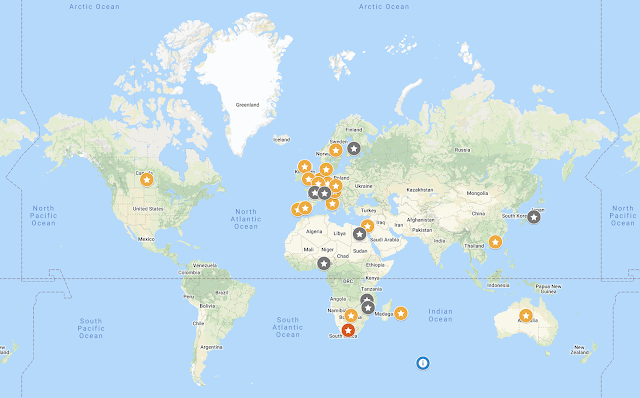
It presents confirmed and probable cases of Omicron. Here’s a list of the top 10 countries ranked by the number of confirmed cases, as of 7:00 PM Pacific on November 29, 2021:

You can also track the Omicron variant on the BNO News Twitter feed. Stay safe earthlings!

Saturday, August 29, 2020

School COVID-19 Tracker

Necessity is the mother of invention. According to an article in NPR, a teacher in Kansas, Alisha Morris, was unable to find data about COVID-19 cases in U.S. schools, so she started collecting data from local news reports and aggregated her findings in a spreadsheet. She later shared her data with colleagues and her district board of education. One thing led to another, and she eventually handed over her project to the National Education Association where Morris and other volunteers are crowdsourcing data.


Data are also presented in Tableau in both map and tabular format.


Kudos to Alisha Morris and all the volunteers—I hope this effort helps inform local policy and decision-making.

Tuesday, July 21, 2020

The Controversial Birth of HHS Protect

The Centers for Disease Control and Prevention (CDC) has been gathering data about COVID-19 patients via its National Healthcare Safety Network throughout the course of the current pandemic and has historically been the primary federal source of data collection for infectious disease outbreaks in the United States. According to the New York Times, this data includes “daily reports about the patients that each hospital is treating, the number of available beds and ventilators, and other information vital to tracking the pandemic.”

On July 10, 2020, the U.S. Department of Health and Human Services (HHS) ordered hospitals to bypass the CDC and send data directly to a new HHS website. That new website is called HHS Protect and went live on Monday, July 20, 2020.


This move was met with skepticism by critics of the current administration for 2 main reasons. The first reason is that CDC has refined its data collection methods over many years, whereas the implementation of a new data collection system is felt to be a risky move in the middle of a pandemic. The other concern is related to fear of a reduction in transparency regarding the data, especially when the question of whether to reopen businesses and schools should largely be answered based on reliable data.

As a result, more than 100 industry groups signed a letter asking Vice President Pence, Ambassador Birx and HHS Secretary Azar to reverse its decision to bypass the CDC for the collection and analysis of COVID-19 patient data. The American Medical Informatics Association also published an open letter stating similar concerns. The folks running the COVID Symptom Study are pleading to its voluntary users to keep using the app to help detect new COVID-19 cases earlier, stating concerns about possible lack of transparency with HHS Protect.

I doubt that HHS will reverse course, so official hospital reporting will now be channeled through HHS Protect. According to the HHS order, options for data submission include:
  1. Submission through one’s state
  2. Submission via TeleTracking
  3. Authorization of one’s health IT vendor
  4. Publication to the hospital website in a standardized format (pending implementation)
HHS Protect currently includes a limited number of data visualizations but also provides access to a downloadable dataset through HealthData.gov.

Thursday, July 16, 2020

COVID-19 Household Pulse Survey

I received a text message from an unknown sender (SMS short code 39242) today. It said that “The US Census Bureau needs your help to understand coronavirus impact” and provided a link.


Initially I suspected that this could be a phishing attempt or some kind of scam, but I noticed that the domain of the URL was covid.census.gov, so I decided to check it out. It’s a survey website that is managed by the U.S. Census Bureau. It clearly stated that this was different than the national census and that they are trying to understand the social and economic effects of COVID-19 on American households.


At the bottom of the survey web page, it references “OMB No.: 0607-1013” so I searched Google and found an entry in the Federal Register that provides context for the Household Pulse Survey:

The Census Bureau has developed the Household Pulse Survey as an experimental endeavor in cooperation with five other federal agencies. The survey is designed to produce near real-time data in a time of urgent and acute need. Changes in the measures over time will provide insight into individuals' experiences on social and economic dimensions during the period of the Covid-19 pandemic. This survey, conducted under the auspices of the Census Bureau's Experimental Data Series (https://www.census.gov/​data/​experimental-data-products.html), is designed to supplement the federal statistical system's traditional benchmark data products with a new data source that provides relevant and timely information based on a high quality sample frame, data integration, and cooperative expertise.

Question domains contributed by the Census Bureau (Census), Economic Research Service (ERS), Bureau of Labor Statistics (BLS), National Center for Health Statistics (NCHS), National Center for Education Statistics (NCES), and the Department of Housing (HUD) seek to measure employment status, spending, food security, housing, health, and education disruptions. Many of the questions that will be asked on this survey have been fielded on other surveys in the past. However, some of the questions are new, designed to explore potential impacts associated with the COVID-19 pandemic response.

After I completed the survey, it provided a link to a website for more information. Apparently data for this survey have already been collected for 10 weeks, and the website provides links to an interactive tool, data tables, and public use files where you can explore the responses to date on your own.

Sunday, July 5, 2020

Opportunity Insights Economic Tracker

An Economic Tracker visualizes the percent change in consumer spending since the first COVID-19 case in the United States on January 20, 2020. There are options to filter charts by industry (apparel & general merchandise, entertainment, grocery, health care, restaurants & hotels, transportation) and consumer ZIP income (high, medium low).


Many additional charts are available for exploration including data visualizations related to businesses, employment, education, and public health, each with their own set of filters. Data are also available for download.

Data originate from leading private companies (e.g., credit card processors to payroll firms) and are curated by Opportunity Insights, a Harvard University nonprofit organization whose purpose is to understand how the COVID-19 pandemic is affecting the economic prospects of people, businesses, and communities across the United States. The Economic Tracker is accompanied by a research paper, non-technical summary, and additional resources.

An article in NPR’s Planet Money summarizes a few key points:
  • Decline in consumer spending is mostly in affluent ZIP codes
  • Businesses in rich ZIP codes laid off nearly 70% of their employees
  • The government rescue effort has failed to rescue the businesses that are most impacted by the pandemic
  • State-permitted reopenings don’t seem to boost the economy
The Opportunity Insights Economic Tracker team concludes that traditional economic tools have limited capacity to restore consumer spending during the COVID-19 pandemic, and they provide a variety of recommendations for policy moving forward. In short, they assert that (1) the only way to drive economic recovery is to invest in public health efforts that restore consumer confidence and spending; and (2) providing and extending targeted assistance to low-income workers impacted by the economic downturn (e.g., unemployment benefits) is critical for reducing hardship and addressing disparities due to the pandemic.

Friday, July 3, 2020

noitazilausiV ataD rehtonA

I know I’ve shared a lot of COVID-19 data visualizations, but another one that’s worth mentioning is 91-DIVOC: Flip the Script on COVID-19.


I suppose the interactive charts are different enough from other visualizations that they “flip the script” on COVID-19. There are several interactive charts, each with multiple settings that are best summarized by the creator: “There are millions of combinations of graphs to view.” 91-DIVOC uses the Johns Hopkins data that was used to power the CSSE COVID-19 Dashboard that I covered in a prior blog. Hope you enjoy geeking out on this data.

Sunday, June 14, 2020

Reopening Criteria Visualized

Moments after I wrote my last blog in which I suggested that everyone should have a view into reopening criteria across the United States, I came across https://www.covidexitstrategy.org which does just that. Below the summary map of the United States that uses red/yellow/green indicators to show progress toward reopening measures, state-level data are presented in a table below:


A second table provides numbers and graphs to depict trends in COVID-19 transmission:


A third table visualizes health system capacity in each state:


Finally, a fourth table displays how each state is doing on testing:


And for you data geeks out there, click on “Get the data” to download the data in CSV format. Happy analyzing everyone!

This Is What a COVID-19 Dashboard Should Look Like

Last month, a scientist named Rebekah Jones was allegedly fired from the Florida Department of Health for refusing to manipulate data so that it would support the state’s reopening plan. According to NPR, Jones wrote, “I would not expect the new team to continue the same level of accessibility and transparency that I made central to the process during the first two months. After all, my commitment to both is largely (arguably entirely) the reason I am no longer managing it.” A rebuttal from the Florida governor is provided here.

Whatever the circumstances, Jones subsequently created her own dashboard which is available through a portal. While the new dashboard currently is dependent on Florida Department of Health data which Jones criticized upon her departure, the team is “working to collect the data without depending on DOH’s live updates.” One feature that I think the public should find particularly useful is the “Reopening Criteria” tab as pictured below:


The reopening criteria that are displayed on the dashboard include (1) Decrease in ER visits fro COVID-like illness, (2) Decrease in ER visits for influenza-like illness, and (3) Decrease in new cases by date. These are all very reasonable criteria to me, and they are similar to other reopening criteria that I recently profiled.

According to NPR, “only two of the state’s 67 counties at the moment meet the state's criteria for further easing restrictions.” Assuming that the data feeding these criteria are correct, one might conclude that Florida’s recently announced plan to reopen schools is not supported by data.

It would be nice if all states and counties had access to data that are presented in the context of their local reopening criteria. It would help inform conversations among the public and among officials who make decisions about public policy.

Saturday, June 13, 2020

Can You Trust COVID-19 Case Counts?

A couple weeks ago, I wrote about a 2-week decline in COVID-19 case counts in Los Angeles, based on data from the Los Angeles County Department of Public Health COVID-19 Dashboard. Here is the same figure from my May 30 blog for your convenience:


It seemed like things were getting better until I looked at data from USA Facts. After downloading the data and generating a 7-day rolling average, I got this result:


The 2-week decline in COVID-19 case counts was nowhere to be seen, and in fact it showed a steady increase in new cases/day. Thinking that this must be due to a discrepancy between the data collection methods of LA County and USA Facts, I went back to the LA County data to update my figures and got this result:


The the 2-week decline in COVID-19 case counts is nowhere to be seen in the LA County data download! What happened to our impression that Los Angeles was on the road to recovery? Did the Sith Lord who erased Kamino from the Jedi archives fudge the LA County COVID-19 data too? To further investigate, I compared the LA County data from today (June 13) against a copy of the LA County data that I downloaded when I wrote my other blog (May 30) 2 weeks ago. I saw differences in the case counts and plotted them over time:


It turns out that new cases/day generally stayed the same or increased, although on some days the numbers went down. However, in the last 2 weeks before May 30, there was a significant increase in cases/day between the May 30 download and the June 13 download, which completely erased the download trend in the 7-day rolling average number of cases/day. I suspect that this is due to a backlog of statistical data that had yet to be entered, and given that numbers went down on some days, maybe some data were re-categorized into other days or errors were corrected. Whatever the case, from these observations, I conclude that you can’t really trust the numbers until a couple weeks later when the data stewards are mostly caught up with data entry and the numbers stabilize.

A couple weeks ago, I thought that Los Angeles was starting to crush the curve, but unfortunately the COVID-19 numbers tell us that we are not, and in fact things are getting worse.

Wednesday, June 10, 2020

Black Lives Matter Protests Visualized

The protests against racism and police brutality targeting black individuals has been taking place on a worldwide stage. The following map visualizes the distribution of protests around the world:


The following map visualizes the distribution of protests in the United States:


Additional data are presented in tabular format, click on the links for more information.

Sunday, June 7, 2020

Putting the COVID-19 Death Toll in Perspective


On June 1, 2020, the death toll from COVID-19 was 104,869. An NBC News article provides some visualizations that put those numbers into perspective.
  • In 4 months this year, more Americans died of COVID-19 than those who died of diabetes in all of 2018.
  • On average, more than 1,000 Americans have died from COVID-19 every day during the pandemic, as of June 1.
  • The COVID-19 daily death rate is more than three times higher than even the harsh 2017 flu season, which killed 61,000 people.
  • The COVID-19 daily death rate is more than 10 times that of car crash fatalities in 2018.
  • 2,977 people were killed in the terrorist attacks on Sept. 11, 2001. As June 1, the daily average of COVID-19 deaths equal that total every three days.
The following table compares selected wars and health issues with the current COVID-19 deaths (100,000 and counting) and average deaths per day (>1,000):


Remember to follow your local re-opening recommendations and stay safe America!

Saturday, May 30, 2020

COVID-19 Road to Recovery

I’ve been tracking the Los Angeles County Department of Public Health COVID-19 Dashboard, and using the data from the Cumulative and Daily Cases and Deaths by Date tables in the CSV download, I’ve updated the 7-day running averages of new cases/day. Here’s what it looks like:


As you can see, there has been what looks like a steady decline in new cases/day for the past 2 weeks. This satisfies the Cases criterion in the Opening Up America Again guidelines which propose gating criteria prior to entering a phased approach to reopening. In reality, most cities had already begun to implement their reopening plans prior to satisfying all the gating criteria. Los Angeles entered Stage II of its Safer L.A. plan on May 8.


Stage II included minor adjustments to the Safer at Home order which allowed a limited number of businesses to reopen if they could provide deliveries or curbside/doorside pickup. Given that Los Angeles entered Stage II on May 8 and new COVID-19 cases have declined since May 15, it appears that the reopening plan has not negatively impacted the trajectory of recovery.

Saturday, May 23, 2020

New COVID-19 Cases in Los Angeles - Fun with Numbers

Earlier today, I wrote about the Los Angeles County Department of Public Health COVID-19 Dashboard which shows the number of daily COVID-19 cases, and I provided a figure in my blog to illustrate the trend. However, I felt unsatisfied with the dramatic day-to-day variation in the number of cases, so I decided to calculate rolling averages over the prior 2, 3, 4, 5, 6, and 7 days. Here’s what it looks like:


Based on a calculated 7-day rolling average, we reached a peak of 897 cases on May 11, 2020 and have seen a decline since then. The last day for which we have data are for May 21, 2020 where the rolling 7-day average was 547 cases.

Not surprisingly, I noticed that the dramatic peaks and valleys of the original data follow a 7-day cycle. For each 7-day period, the nadir usually falls on a Sunday (e.g, April 26, May 3, May 10, and May 17), and the peaks occur the following Monday and/or Tuesday which are likely to be the cases that were not reported over the weekend. I can think of a couple of possible reasons for this. First, there may be less staffing on weekends which may result in less case reporting. However, given that the nadir usually occurs on Sundays, I also wonder if patients seek healthcare less frequently on Sundays, perhaps because they are attending church or other activities. Regardless, a 7-day rolling average may be a good way to look at statistical trends because it smooths out the daily variation in case reporting.

I hope that we continue seeing a downward trend of daily cases as we continue reopening businesses.

Saturday, May 16, 2020

Google COVID-19 Community Mobility Reports

To help measure the impact of social distancing, Google has provided COVID-19 Community Mobility Reports that chart movement trends over time at the following places:
  • Grocery & pharmacy: Mobility trends for places like grocery markets, food warehouses, farmers markets, specialty food shops, drug stores, and pharmacies
  • Parks: Mobility trends for places like local parks, national parks, public beaches, marinas, dog parks, plazas, and public gardens
  • Transit stations: Mobility trends for places like public transport hubs such as subway, bus, and train stations
  • Retail & recreation: Mobility trends for places like restaurants, cafes, shopping centers, theme parks, museums, libraries, and movie theaters
  • Residential:Mobility trends for places of residence
  • Workplaces: Mobility trends for places of work
Reports in PDF format are available for a variety of countries and regions. For the United States, individual reports are available further subdivided into state- and county-level data.


Changes for each day are compared to a baseline value for that day of the week, where the baseline is defined as the 5-week period from January 3 to February 6, 2020. The data come from users who have opted in to Location History for their Google Account. Google recognizes that anonymity may be compromised in sparsely populated areas. In such instances, they state, “Not enough data for this date: Currently, there is not enough data to provide a complete analysis of this place. Google needs a significant volume of data to generate an aggregated and anonymous view of trends.”

In addition to providing reports in PDF format, Google also allows visitors to download data in CSV format. Data geeks rejoice! More information is available in this blog. What does community mobility look like in your area?

Saturday, May 9, 2020

Is Your State Doing Enough COVID-19 Testing?

Most of the United States has some kind of stay at home order in effect as a social distancing response to the COVID-19 pandemic, and many states have begun to gradually re-open businesses or are planning to do so in the near future. Some key factors that should drive the decision to nudge our lives closer to normal include getting the infection under control (seeing a declining number of new cases), having a contact tracing solution in place, and having adequate testing capacity.

It is well known that the US has had inadequate means to test for SARS-CoV-2 since the initial outbreak, and the problem was not adequately addressed as the infections grew to pandemic proportions. A recent analysis shows that more than half of US states aren’t doing enough COVID-19 testing, based on data from the COVID Tracking Project.

Based on the same data, the folks from NPR have created a graphic to illustrate how each state is performing in terms of current daily testing versus its minimum target.


The visualization displays the size of the outbreak for each state, as represented by deaths per 100,000 people, with a current peak value of 132 deaths per 100,000 people in New York. It also displays current daily testing versus a minimum target threshold that is needed by May 15, 2020, and this is measured as tests per 100,000 individuals. Most states are well below their May 15 target thresholds. Finally, the visualization shows the positive test ratio which is the percent of tests that come back with a positive result, and whose desired target is 10% or less.

How is your state doing?

Saturday, May 2, 2020

Shelter in Place Index

On Wednesday, March 11, 2020, the World Health Organization declared that COVID-19 had reached pandemic proportions. Shortly thereafter, different parts of the United States began rolling out social distancing and other recommendations for nonpharmaceutical interventions. How did our nation respond to shelter in place orders? The folks at SafeGraph provide a dashboard view of their Shelter in Place Index (a.k.a. Stay at Home Index):


The dashboard visualizes the change in the percentage of people staying home as compared with baseline measures. The “stay at home” determinations are based on data from more than 45 million smartphones which SafeGraph asserts is a representative sample of Americans.

The index represents whether someone stays at home or not. It doesn’t factor in the distance traveled from home because “one does not need to travel long distances to undermine social-distancing and enable viral transmission” according to SafeGraph. “Home” is defined as “ the most common nighttime location in recent months identified to a precision of about 100 square meters.” SafeGraph provides transparency about their methodology and data schema for those of you who want to take a closer look.

While Americans appear to have increasingly stayed at home from mid-March to a peak in mid-April, it appears that we have relaxed our adherence to shelter in place recommendations in the past couple weeks as discussed in this article. For a graphic comparison, see this rolling 3-day average of new confirmed COVID-19 cases in the United States:


We appear to be holding steady with the number of new cases per day. The obvious conclusions are that (1) at least the number of daily cases is not increasing and (2) it would be better if we started to see a decline. We are still in the midst of a global pandemic, and we still have a lot of work to do before we get things under control.

Wednesday, April 29, 2020

Another COVID-19 Dashboard

COVID-19 dashboards are all the rage nowadays, and I’ve recently written about many of them. Here’s another one called COVID-19 Watcher which incorporates data from multiple sources for its online interactive dashboard.


The dashboard allows you to specify one or more regions (county, city, state, or the entire United States), display the number of cases or deaths, show daily or cumulative views, and toggle the scale between linear or logarithmic. A final “adjust for population size” parameter enables you to view the number of daily cases or to normalize the result to daily cases per 10,000 residents.

In another view, users can visualize COVID-19 testing volume and choose to display positive tests and/or negative tests and/or total tests for one or more states. And once again, data may be shown as number of tests or normalized to number of tests per 10,000 residents.

Data sources include the New York Times, Johns Hopkins, COVID Tracking Project, and CDC. More details of the dashboard are presented in this article.

Monday, April 20, 2020

Facebook COVID-19 Symptom Map

A COVID-19 symptom map has been released in a collaborative effort between Facebook and Carnegie Mellon University.


The map shows an estimated percentage of people with symptoms of COVID-19. These are not confirmed cases but rather data from people who self-report certain symptoms that are characteristic of COVID-19. Data are displayed based on counties or hospital referral regions, and the map can also display the same geographic distribution of flu symptoms.

According to the site, the map is not intended to be used for diagnostic or treatment purposes or to be used as guidance on any type of travel. Rather, the estimates are intended to help policymakers and health researchers to forecast potential COVID-19 outbreaks.


The surveys are conducted on a voluntary opt-in basis for Facebook users in the United States according to this article, and Facebook plans to expand the surveys for international use to report of global symptom prevalence. Although Facebook administers the surveys, the data are stored by the Delphi Research Group at Carnegie Mellon University in an initiative called COVIDcast. More information is available here and here.

Sunday, April 19, 2020

Tracking the COVID-19 Reproduction Number

The basic reproduction number, represented by R0 (and pronounced “R naught”), is an epidemiologic statistic that is used to quantify the transmissibility of an infectious pathogen. R0 represents the average number of people who are infected by a person with the infection. If R0 > 1, it means the overall number of people with the infection is growing. If R0 < 1, it means the overall number of people with the infection is shrinking, and the infection will eventually end. The effective reproduction number can also be specified at a particular time t, and it is represented as R(t) or Rt. Much more is written about the reproduction number in this article.

Instagram founders Kevin Systrom and Mike Krieger introduced Rt COVID-19, a website that presents Rt values state by state.


In the main chart, you can view current and past values of Rt for all states and also filter by the ten largest, no shelter in place, northeast, west, midwest, and south. There are also state-specific charts where you can see current and historical Rt values.

Case count data from The COVID Tracking Project are used for these visualizations, and Kevin Systrom explains his methodology for calculating Rt. This related article provides more information. A limitation to any statistic related to COVID-19 is that we don’t truly know the number of actual cases due to the fact that we still have limited testing capacity, but the numbers are interesting nonetheless. How is your state doing?

Saturday, April 11, 2020

COVID-19 vs. Top 15 Causes of Death

Here’s another interesting COVID-19 data visualization that shows the growth of COVID-19 as a cause of death relative to the other top 15 causes:


Source: https://public.flourish.studio/visualisation/1845748/