Showing posts with label Map. Show all posts

Saturday, July 19, 2025

3D Modeling Streets and Terrain

I previously wrote about a couple of websites that allow you to create STL models of Earth’s surface: Terrain2STL and TouchTerrain. I recently discovered another website that allows you to create 3D models of both terrain and streets: Map2Model.

While Terrain2STL and TouchTerrain focus on generating 3D models of terrain, Map2Model is focused on generating 3D models of “typical” map features such as roads, buildings, water, and other features.

Start by searching for an address or a named location, then zoom in/out and center the map where you’d like to generate your 3D model. Choose a shape for your model: rectangle, square, circle, etc. Then position and size your shape on the map and press the “3D Preview” button to view, zoom, and rotate your 3D model. If happy with your model, export it in either 3MF or STL format.


For roads, water, grass, buildings, sand, and piers, there are settings that allow you to modify colors, model height, and other options which are useful if exporting in 3MF (but will not be represented in STL files because those file represent only geometry data). There are experimental features such as adding topography (similar to the terrain-focused 3D modeling websites) which in my experience with a few locations works pretty well.

Resultant models can be used for personal use, but for commercial use you’ll need to obtain a commercial license. Many thanks to Smoggy3D for developing such a nifty application!

Sunday, September 15, 2024

Wildfire Maps

In California, the fire season generally starts in June or July and runs through October or November. Currently there are many fires burning in California and in many other parts of the United States (and all over the world for that matter). If you’d like to visualize wildfires on a map, you have several options.

CAL FIRE displays current wildfire information in the state of California. There are options to display recent perimeters, active air assets, and other options.


Google Maps can display wildfire information if you click on Layers > More > Wildfires.


MSN Weather Map also has a map with a dedicated Fire Information layer.


All screenshots were taken within the last hour, so you can compare and contrast the available information and visual presentation. Be safe out there!

Sunday, July 7, 2024

3D Modeling Earth’s Surface


Have you ever wanted to create a 3D model of a specific section of earth’s surface? I heard that it could be done using topographic data from the U.S. Geological Survey (USGS). So I asked ChatGPT to tell me step by step how to convert USGS topographic data into a 3D model in .stl format (see thread here). In response, ChatGPT told me that I need to:
  1. Download USGS topographic data
  2. Preprocess the data using GDAL to convert to ASCII Grid
  3. Convert ASCII Grid to a 3D mesh using QGIS and the DEMto3D plugin
  4. Optionally refine the 3D model in MeshLab
  5. Save the final model in STL format

That sounded complex to me, as it involves applications and file formats that I have not previously worked with. Fortunately, I discovered that there is a much easier and faster way to get 3D models in .stl format. Simply use a website that provides this specific service. Here are 2 options:

Terrain2STL is a website that allows you to create .stl models of the surface of Earth. Its interface is pretty straightforward. You can zoom/drag to a location using Google Maps which defaults to Terrain View. You can also enter GPS coordinates (refer to this post for a refresher). Next, enter details about the width, height, and other details related to the dimensions of your desired model. Then adjust settings related to water and base height and finally export your model in .stl format. Terrain2STL has the advantage of its simplicity, but its main disadvantage is its resolution which is limited to 90 meters. Here is a screenshot of Terrain2STL (click to enlarge):


TouchTerrain is another website that allows you to create 3D printable terrain models. Similar to Terrain2STL, TouchTerrain allows you to zoom/drag to a location using Google Maps, but TouchTerrain also allows you to search for a place by its name, address, or GPS coordinates which can be very useful. TouchTerrain also allows you to choose from 3 different elevation data sources, each of which has varying resolution ranging from 10 to 2000 meters, depending on its purpose. For me the default USGS data source with 10 meter resolution produced a model with the level of detail that I was looking for. It also has inputs for 3D printer settings such as your build plate dimensions to help you determine the maximum size of your model. After inputting the relevant settings, generate and download your .stl model. Here is a screenshot of TouchTerrain (click to enlarge):


After you get your desired model from either Terrain2STL, TouchTerrain, or another method, you’ll be ready to slice and 3D print your model.

Tuesday, September 7, 2021

The Journey of a Rain Droplet

River Runner is a website that visualizes the path of a rain drop from any point in the contiguous United States to its end point (usually the ocean, sometimes the Great Lakes, Canada/Mexico, or another inland water feature). Its instructions are simple: “Click to drop a raindrop anywhere in the contiguous United States and watch where it ends up.”


To learn more about the data resources that are used to visualize the path of a raindrop, visit the River Runner GitHub site and the Hydro-Network Linked Data Index.

Thursday, November 12, 2020

Real-time Food Delivery Tracking

I recently ordered a meal to be delivered to my home, and I expected to contend with the usual problems of not knowing where the delivery person is and when my food will arrive. However, I was pleasantly surprised when I received a text message from the restaurant that said I could track my order through VROMO.

As you can see from the screenshot, it is a typical map interface where you can see where the driver is located (indicated by the yellow “VR” symbol) in real time. While not pictured, you can also see your location pinned on the map. You can also click on the phone icon at the lower right of the screen to call or text your driver if needed.

One limitation is that you cannot see the driver’s intended destination. While my delivery guy was only 4 blocks away from me, he turned at an intersection and drove away from my home, so I figured that he had other deliveries on the route. I thought he was about 1 minute away, but in reality it was another 25 minutes before he arrived. It might be nice to allow the driver to enter all destinations and then show the customers how many stops the driver intends to make before delivering your food. This would also enable the app to provide somewhat accurate estimates of arrival times.

In any case, VROMO is a step in the right direction and a welcome addition to a suite of technologies that make it easier to have food delivered to your home.

Saturday, September 12, 2020

What’s Your Local Air Quality Index?

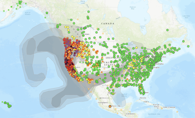
Since wildfires are burning across the western states, the air quality has been worse than usual in many parts of California, Oregon, and Washington due to the smoke.

Did you know that there is an air quality index (AQI) that quantifies the amount of pollutants in the air? It runs on a scale from 0 to 500, with higher values representing greater health hazards.

To find out AQI values in your area, visit AirNow which is a website run by the Environmental Protection Agency. There is also a mobile app for Android and iOS. Here’s an example of the current air quality in Los Angeles:

There is also a Fire and Smoke Map that overlays—you guessed it—fires and smoke information on the same map. Here’s a view of the continental United States which gives you an idea of how far-reaching the effects are of the smoke from all the wildfires:

You can drill down to see information for a particular wildfire:

And you can also click on each of the colored dots to view information that has been acquired from a specific air quality sensor.

There is a lot of other information on AirNow, including an option to receive air quality notifications.

LA Times Wildfires Map

Here’s another map of the wildfires burning in California:

Maintained by Casey Miller of the Los Angeles Times, this map provides information about fire origins, fire perimeters, hotspots, mandatory evacuation zones, evacuation warning zones, and air pollution data.

Currently there are 44 fires burning across the state, and for each fire, visitors can see the name of the fire, acres burned, fire duration, percent containment, and of course the location of the fire on the map which is provided by Mapbox.

Stay safe out there.

Monday, March 16, 2020

More COVID-19 Data Visualizations

If you’re trying to track the spread of COVID-19 in near-real time, perhaps you found my recent post about Dashboard Visualization of the COVID-19 Pandemic to be useful. Since then, I’ve found a few more visualizations that I’d also like to share.

The first is a U.S. Coronavirus Tracking Map that shows confirmed COVID-10 cases and deaths, based on data from federal, state and local officials.


The second is a collection of statistics and visualizations from Worldometer which is run by an international team of developers, researchers, and volunteers with the goal of making world statistics available in a thought-provoking and time relevant format to a wide audience around the world.


Finally, Our World in Data provides COVID-19 statistics based on data from the World Health Organization’s situation reports. One interesting chart allows you to see the number of cases over time and compare them across countries. It also lists doubling times and other interesting information.


Remember that most data and visualizations related to new cases reflect the time of detection rather time of actual infection. This is due to possible delays in testing which has occurred in the U.S. With that limitation in mind, I hope you’ll find these maps and statistics to be useful.  Above all, stay safe and remain calm. We’ll eventually get through this!

Sunday, March 15, 2020

Mapping School Closures Due to COVID-19

If you’re a parent of a school-aged child like me, you might be impacted by school closures due to COVID-19. The folks at Education Week are collecting information about school closures in the United States and visualizing the data on a map.


If you’re a geek like me, you’ll be happy to find that the data are also presented in tabular format and made available for download. For a full-page version of the map, click here.